How to improve your company's productivity with data visualization
Companies plan and project their performance with the help of their finance teams.
They share objectives and progress reports.

This team compiles market information, the work of the company's stakeholders, etc.
In order to do their job, they need to define objectives for each department and service.
In order to share these objectives, field managers often receive information in the form of a table containing the values to be achieved and the values achieved.
These tables allow them to steer their activity in the right direction to maximize the success rate.
They can find quantitative as well as qualitative objectives on tables, such as :
- Sales increase objectives for a product compared to the rest of the products in the same category.
- Inventory value reduction objectives to optimize logistics flows and order management.
But this table format is not optimal, it is difficult to read and not very comprehensible, which makes it difficult for managers to achieve their objectives.
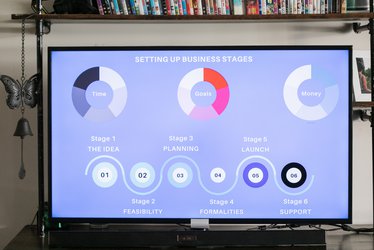
To avoid this, we have created a top 5 formatting of performance indicators:
Categories
5) standard graphic representation: graph, histogram, ...
4) chronogram
3) gauge
2) color contrast
1) Benchmark
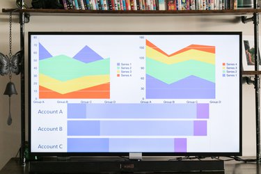
5) Standard graphical representation: pie chart, histogram, ...
In the context of monitoring objectives, a graphical representation of data allows for the rapid visualization of performance indicators. The democratization of the use of data helps to monitor sales performance, budget, energy consumption, etc…
The logical evolution of these representations is to allow a dynamic use of the available indicators, no longer restricting the dashboard to a photo but to a full-fledged analysis tool. The design of the dashboard must be thought out in order to meet the expectations of the user, both in terms of the indicators it contains and the navigation it offers.
4) Chronogram
It is used to represent different elements of the business, such as events or time milestones within which objectives must be achieved.
The projection of this data in chronograph form makes it much easier to read than a list of dates.
Ex: If a company has a goal of 100 million in sales over 12 months, then the contributors will be able to locate the achievement of their goal in time.
If the company's sales team is at 25% of this objective after 3 months, then they will clearly see that they are on time. On the other hand, if the team is only at 35% after 6 months, then they will understand that they are behind schedule.

3) Gauge
The gauge allows you to clearly display progress in relation to a goal, it is a common reading (Download, Fuel, Speed, etc…) that easily gives a notion of achievement.
If gauges are in the form of a dial, it is easy to show values that exceed the objective. This pushes managers to exceed their goals because they will always have the feeling of space to fill.
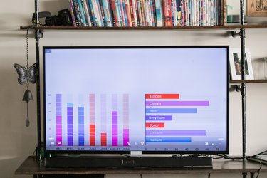
2) Color contrast
They are quite visual and make it easy to differentiate elements of a graph. They give a visual sense to a figure through colors and attract the eye to the structural elements for its analysis. Furthermore, they can be used for all the elements that make up a graphical visualization.
Like the points of a curve, the bars of a histogram, but also materialize as an arrow that goes up or down, a line to reach or avoid.
Example:
To draw attention to a dashboard, certain figures can be colored to show their more or less positive aspects in a clear, quick, and efficient way.
Red can be used as a negative indicator for figures that are lagging behind; these are the ones on which managers must focus their corrections.
1) Benchmark
It allows employees to compare their different results to position themselves in relation to their performance and that of their colleagues. It is a motivating way of seeing things that encourages productivity and mutual improvement of teams.
Example: in the context of a reseller, being able to display the sales indicators by region and compare them.
These forms of visualization are above all at the service of a performance strategy for the company
Data visualization allows for increased productivity thanks to various visualization tools that push teams, departments, and entities to surpass themselves.
Nodata allows for the simple and effective implementation of performance indicator monitoring through dynamic and visual dashboards, including :
- All the modern graphic representations.
- Advanced customization capabilities to ensure integration into the organization's graphic charter and strong user adoption.
- Collaborative features: to exchange, explain and justify the progress of objectives. This guarantees good communication between the different departments.
Why Nodata?
Among the tools capable of implementing data visualization, Nodata appears to be the only one providing a viable economic model for this type of large-scale deployment. Nodata is designed and oriented for mass distribution.
Related Articles

Digital projects
Comment améliorer la productivité de votre entreprise grâce à la data visualisation
Les entreprises font une planification et une projection de leurs performances grâce à leurs équipes financières.
Elles partagent les objectifs, mais aussi leurs états d’avancement.
Read the article

Digital projects
Application of RBAC to microservices infrastructures
With the many evolutions of the internet over the past years, the appearance of the cloud, and mobile applications to make our private and professional life easier, the question of simplifying and unifying all our services came up. And it is with these novelties that different technologies, protocols, and paradigms have appeared.
Read the article
Digital projects
Application des RBAC aux infrastructures micro-services
Avec les différentes évolutions d’internet ces dernières années, l’apparition du cloud et des applications mobiles afin de rendre notre vie privée et professionnelle plus simple, la question de simplifié et unifié tous nos services est venue se poser. Et c’est avec ces nouveautés que différentes technologies, protocoles et paradigmes sont apparus.